Vibha Thakur | Portfolio
Home
Work
About
Resume
Contact
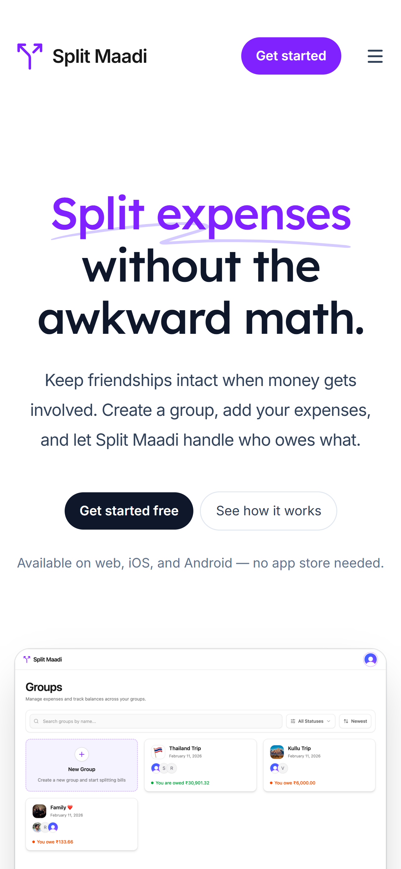
Split Maadi
Split Maadi is a expense-sharing app designed to split expenses and track balances.
seamless

FOUNDATION
Why I built SplitMaadi?

THE FRICTION
After Splitwise introduced a daily cap on how many expenses you can add, I started searching for another alternative. At first, this sounded like a simple problem — the market was flooded.
THE DISCOVERY
But the more I looked, the more I realized that the product I wanted was surprisingly hard to find. Most tools felt cluttered and disconnected from the social experience. That was the point where I stopped searching and decided to build one myself: SplitMaadi.
”Maadi” is a Kannada word that means “do it”.
THE VISION
“We wanted to turn what often is ‘chore’ into a seamless part of the group activity.”
Before designing SplitMaadi, I explored how people currently manage shared expenses and what challenges they face with existing tools. I reviewed product reviews, online discussions, and user feedback across forums and app stores to understand the common frustrations around expense-sharing apps.
User Requirements (P0/P1)
Research


No ads

A clean interface focused on utility. Intrusive advertisements should never disrupt the expense logging flow.

No Limits

Many users expressed frustration about restrictions such as daily caps on adding expenses in free tiers.

No data deletion

History must remain intact indefinitely. It should never delete my past expense history.
The Brief
Manage Groups

SplitMaadi is an expense-sharing app that is simple, practical, and works well.
Competitive Analysis: Understanding Existing Solutions
The closest alternatives were the built-in expense-sharing features inside payment apps like PhonePe and Paytm. They were usable, but only up to a point. Desktop support was almost non-existent. And attachment history was also not something I could rely on, since these apps would delete it after a few months.
Features
UNLIMITED EXPENSES
AD-FREEEXPERIENCE
DESKTOPSUPPORT
PERSISTENTHISTORY
LOCALIZEDUI
SplitMaadi

Splitwise


PhonePe


Paytm
Finding 1 : Simple user experience
Adding even a simple expense took too many clicks, mainly because this feature was hidden deep inside the app.
Finding 2 : Cross platform support
Sometimes I may add an expense on my phone, and sometimes I may want to check balances later on my laptop. So being cross-platform was an important requirement for me, not an extra nice-to-have.
Finding 3 : Attachments should be supported properly
Expenses are not always just numbers — users often need to attach receipts or images for reference.
The Problem:
Splitting Expenses Shouldn’t Be a Time-Consuming Chore.
Deep diving into the friction filled journey of splitting bills within bloated payment apps.

Rahul, 28
“I just want to split the dinner bill with my three friends, why is it 12 clicks deep? Plus, my history keeps getting deleted and there’s no proper way to add receipts. ”
Frustrated
Time-Poor
Overwhelmed
Flow 1 - Rahul tries to add a simple group expense on a typical Finance app (e.g. Paytm/PhonePe)
Rahul opens a cluttered finance app (PhonePe) Home screen, full of unrelated services. Finding expense splitting is already a challange

He uses the search, but receives confusing options. Finding the “exact” “Add Expense” is hard as it’s a secondary feature, not immediately visible.
He is forced to select from a rigid list of categories (Travel, Food, etc.) before he can enter any details.
Adding a receipt is hidden or non-existent.
"The process fails Rahul entirely when he discover that critical records like receipts are automatically deleted."
Now that the problem is clear, let’s dive into the solution.
Flow 2 - Rahul uses Splitwise for Group Expense Logging

Rahul, in “Discovery” mode sees a promising clean screen for direct seamless entry.
Opens the app, and finds it is a moment of truth, but he manages to enter details.
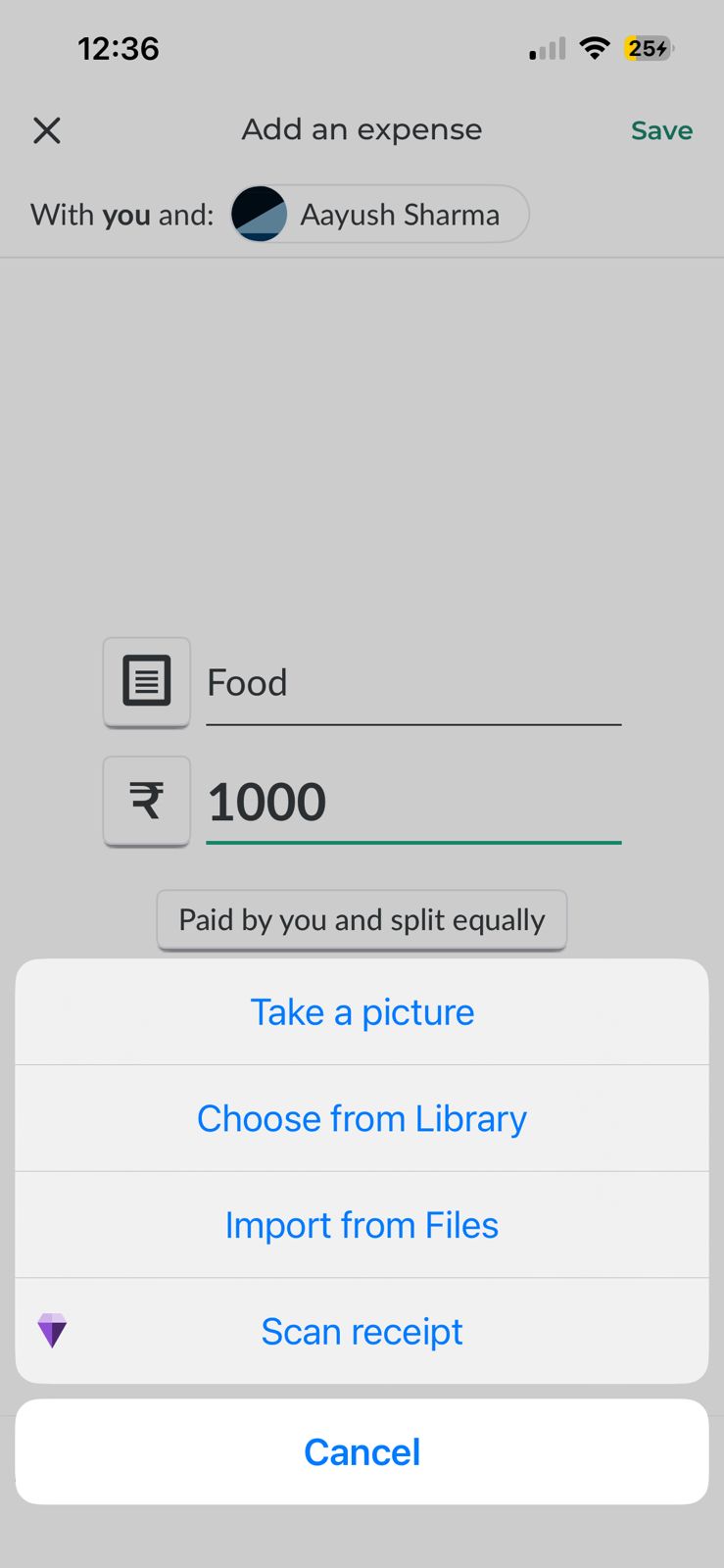
Repetitive process, standard flow. Attaches a receipt for visual trust. He has added multiple.
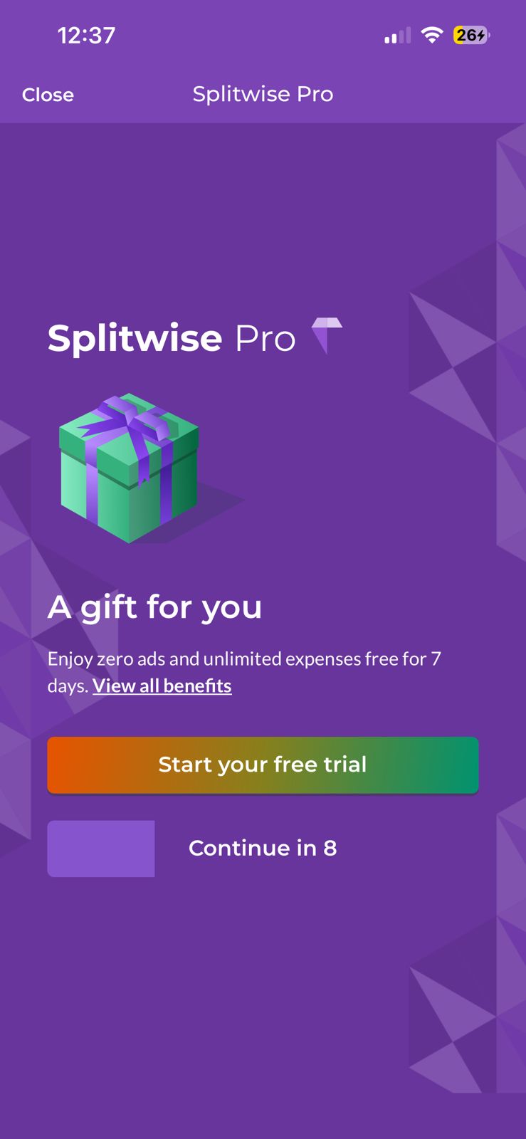
A large paywell pop-up blocks him from adding his 3rd expense .
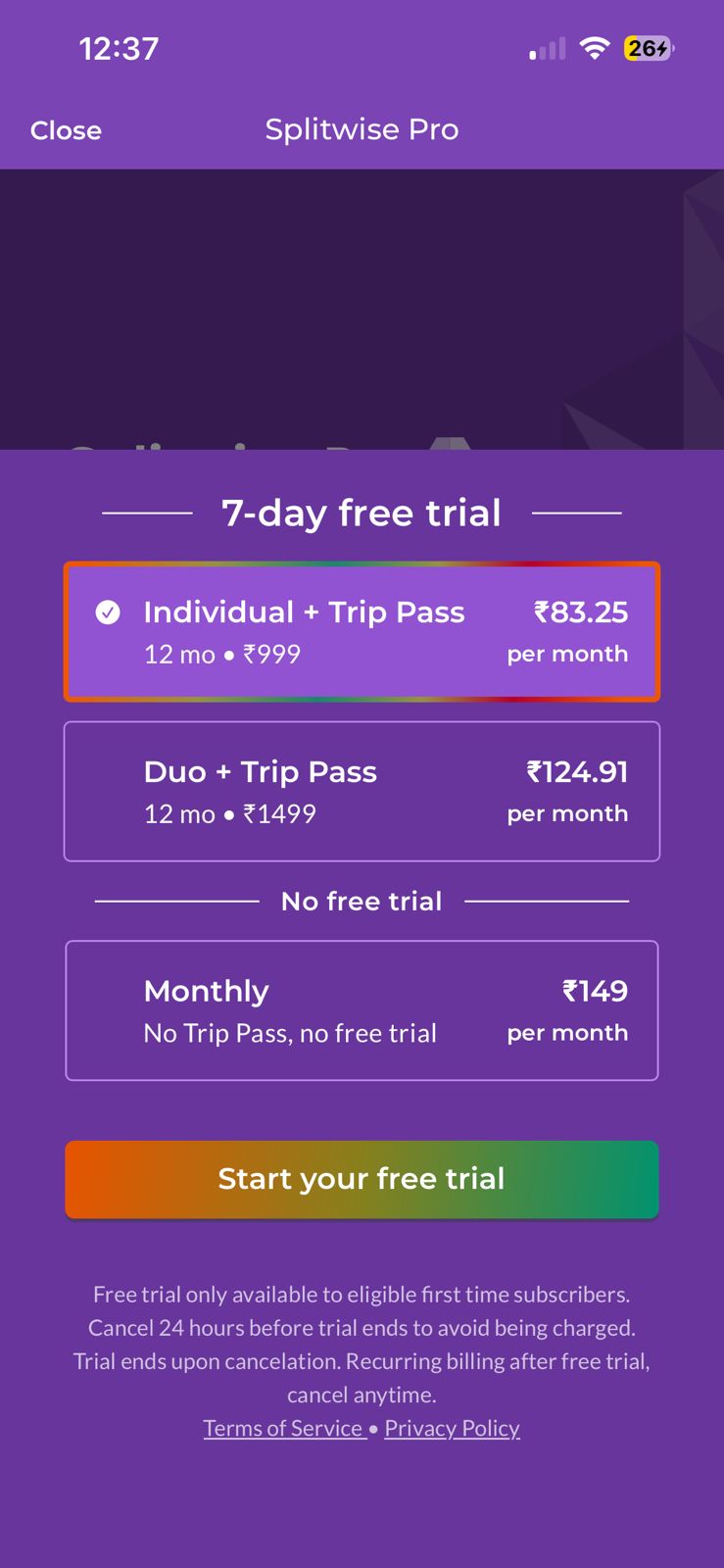
Faced with a high-friction subscription, Rahul leaves the task incomplete. Frustration at complex paywell.
The Solution:
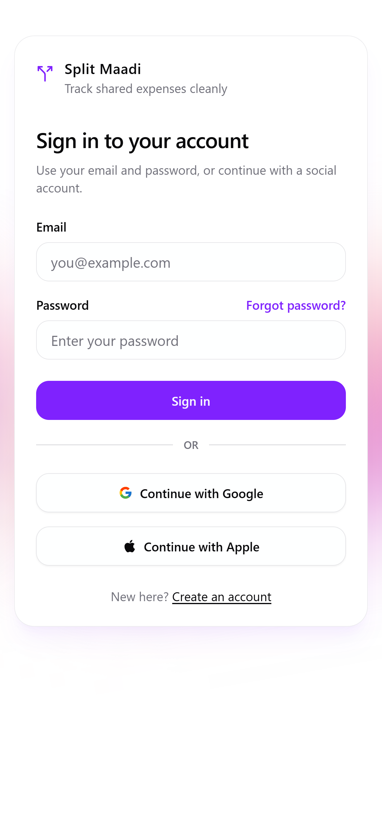
Direct App DiscoveryRahul lands on a minimal landing page. Direct CTA’s avoid distraction, ensuring a quick entry to the application.

Zero-Friction LoginRahul Sign up directly on the simple, secure ‘Sign in’ page. Zero promotional banners or ads.

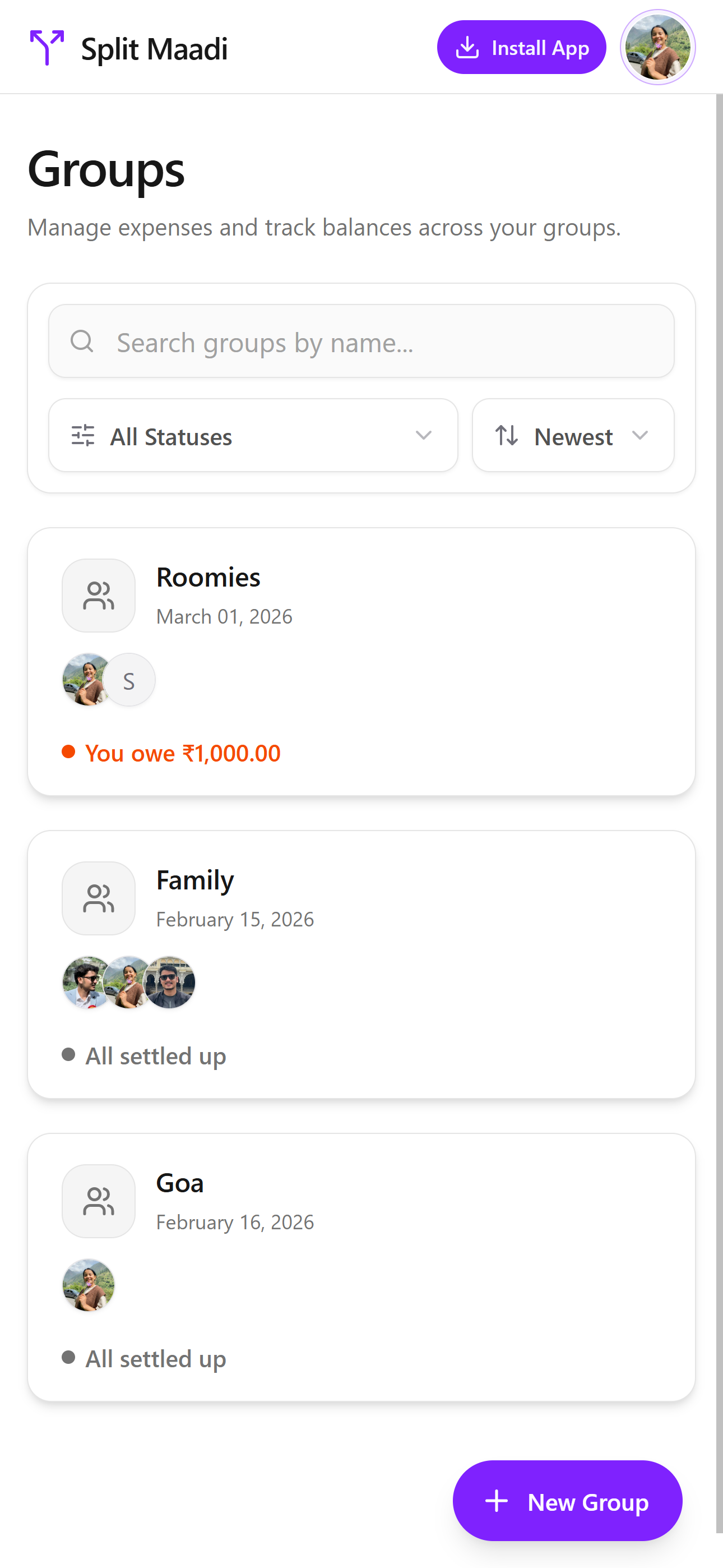
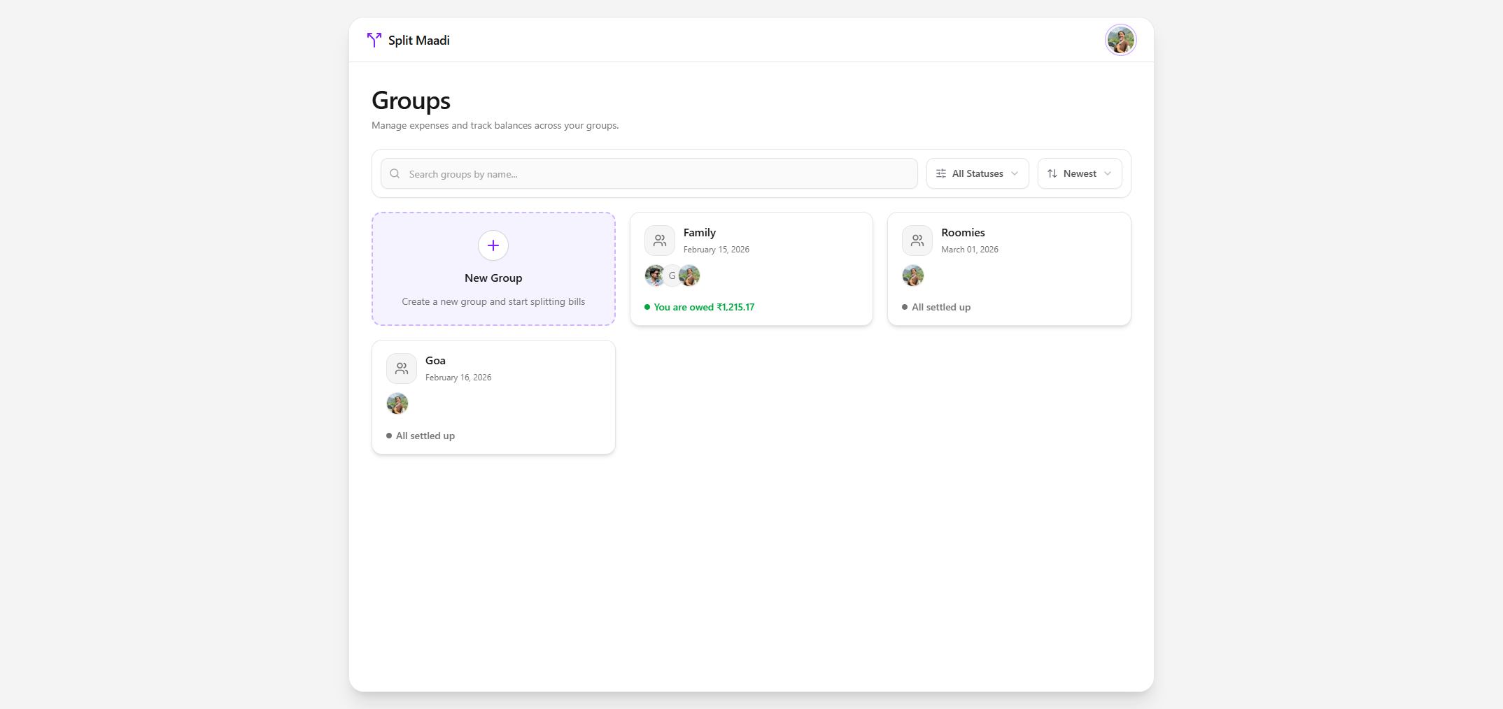
One-Tap EntryHe instantly accessed his existing groups, like ‘Family’ and ‘Roomies’.

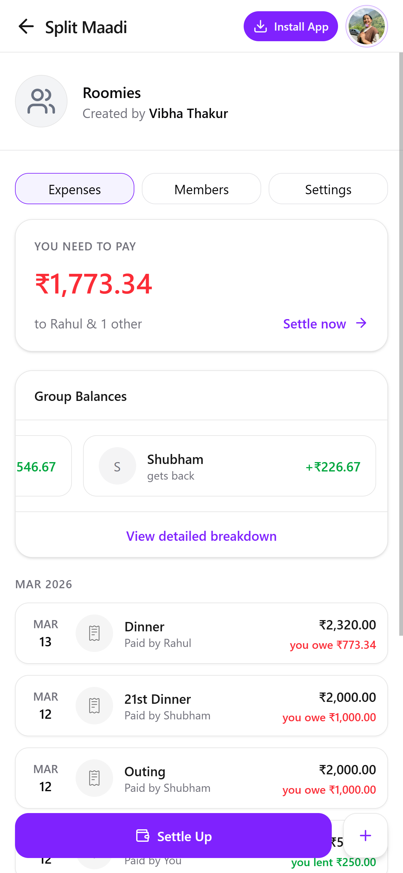
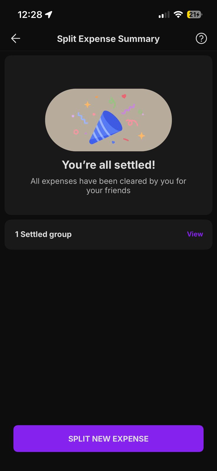
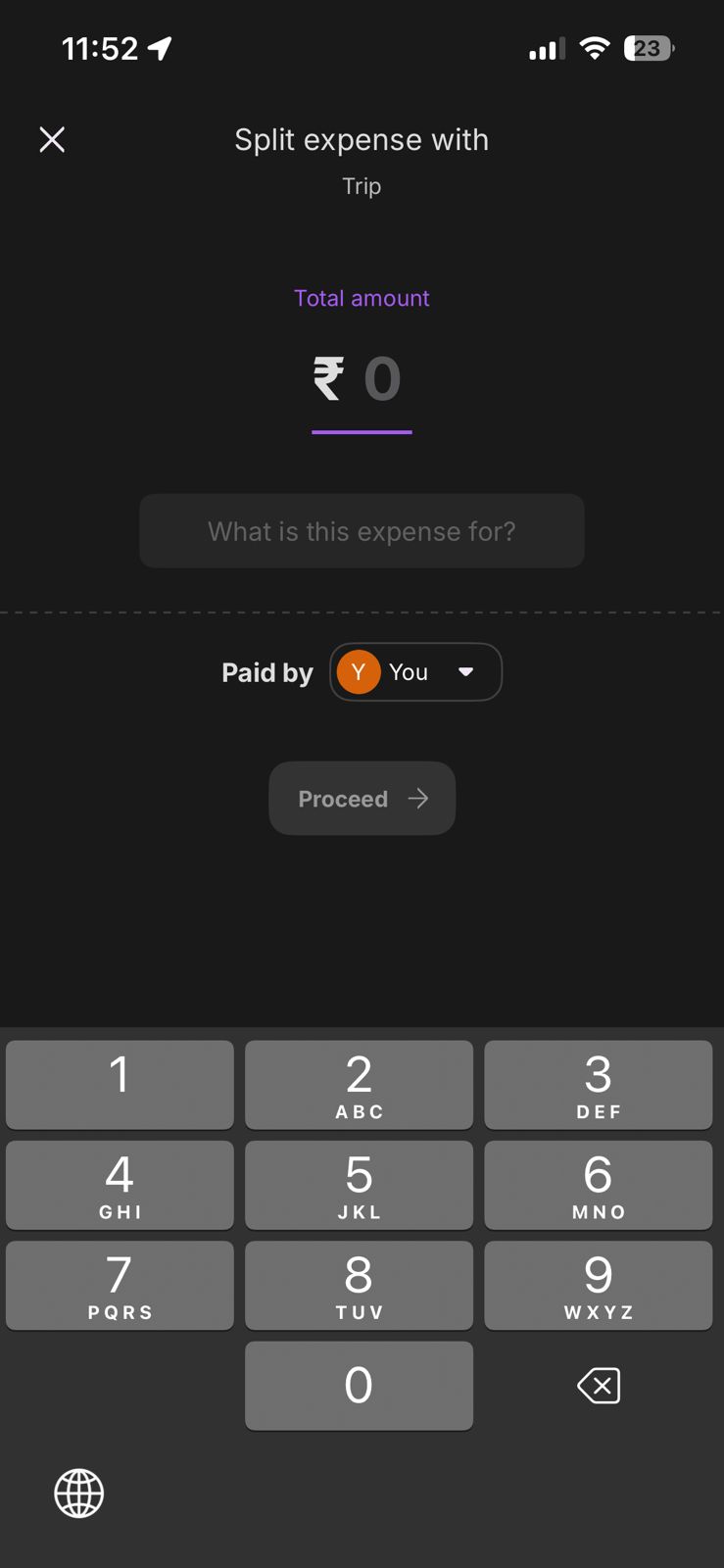
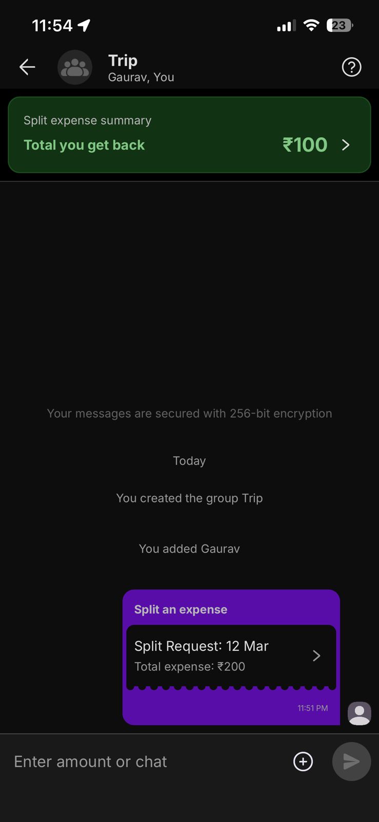
He settle’s up with pre-calculated balance ‘Dinner’ for Rs. 2320.00, leads to a single, straightforward settlement screen.


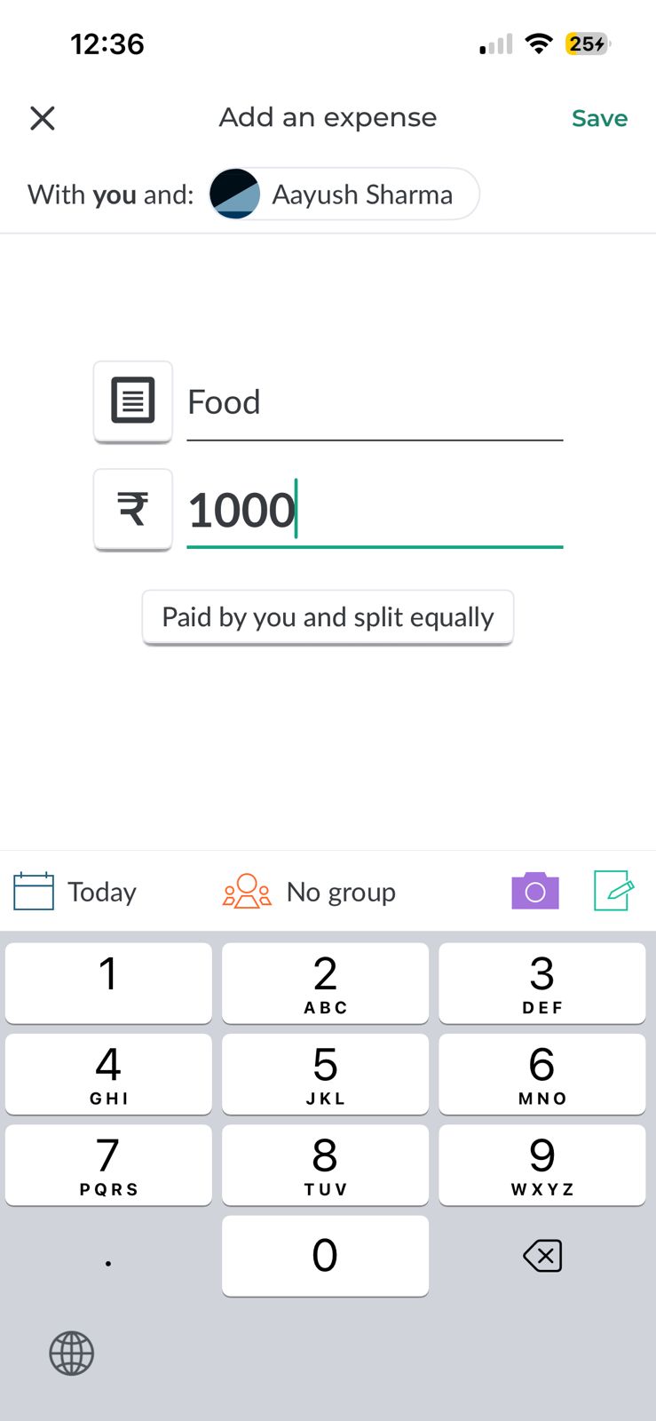
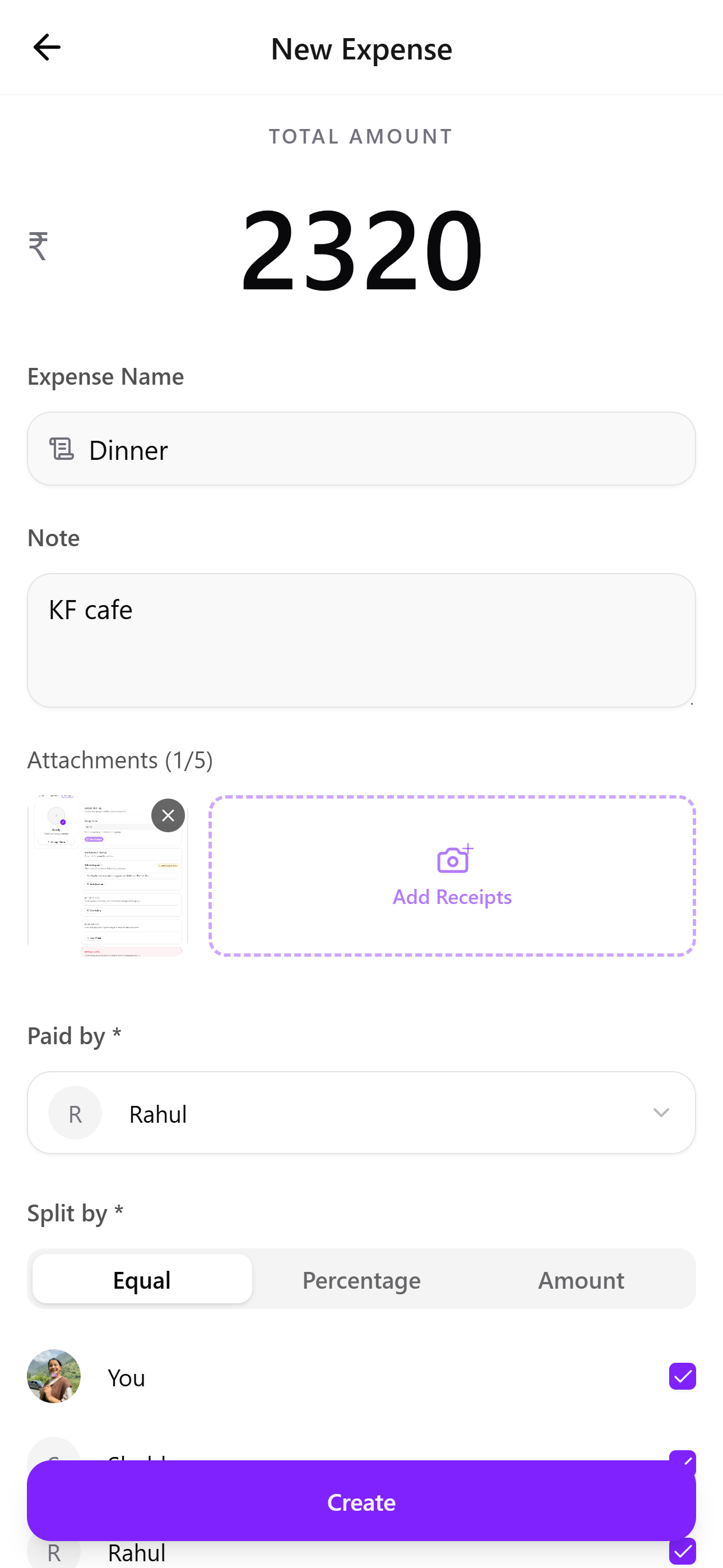
He added new expense ‘Dinner’ within seconds. Receipt attachment is integrated for trust.
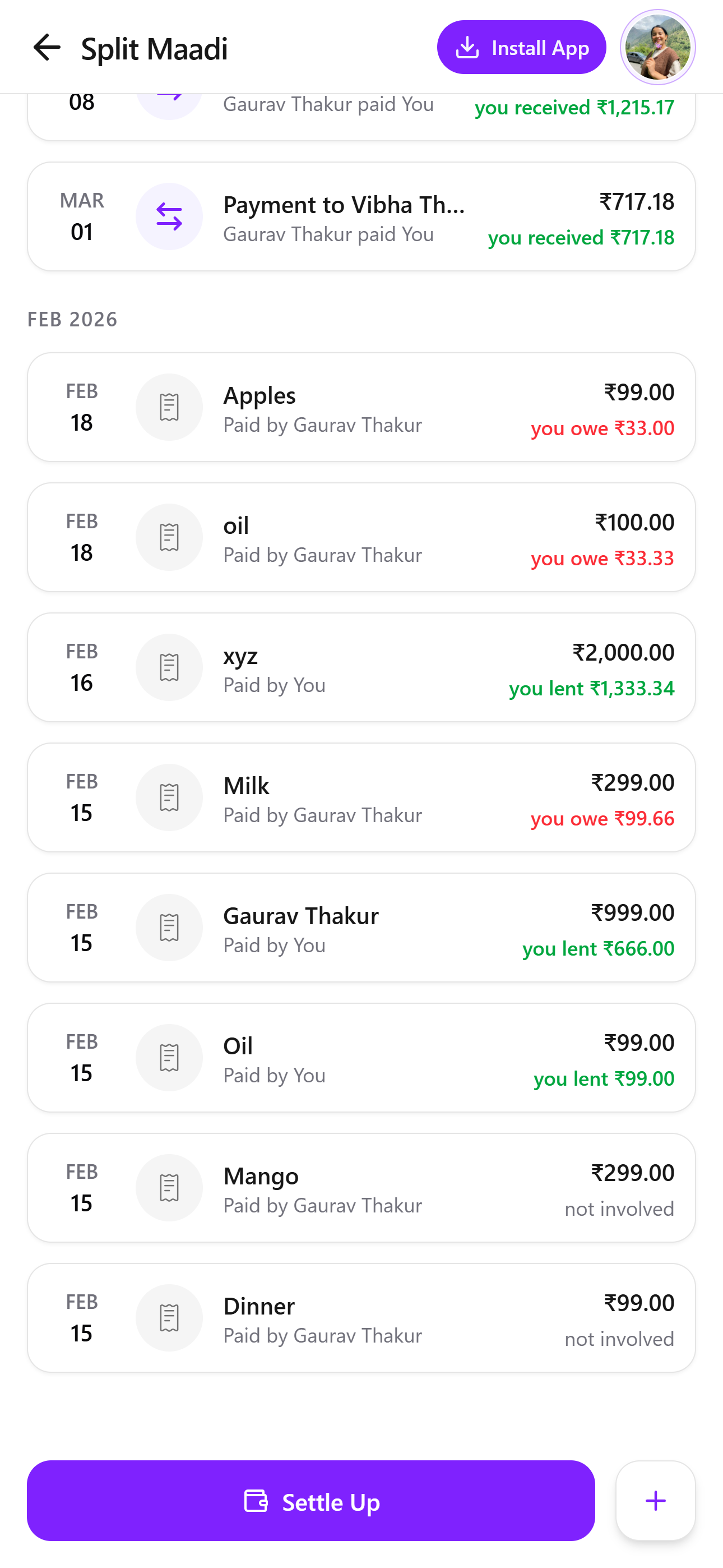
Seamless HistorySplitMaadi preserves every reliable expense history of Rahul, across mobile and laptop.
Design Evolution: From Friction to Flow
My goal was to create a polished, minimalist, high utility experience as it is today. So we asked 5 students and busy professionals to uncover friction points in SplitMaadi.
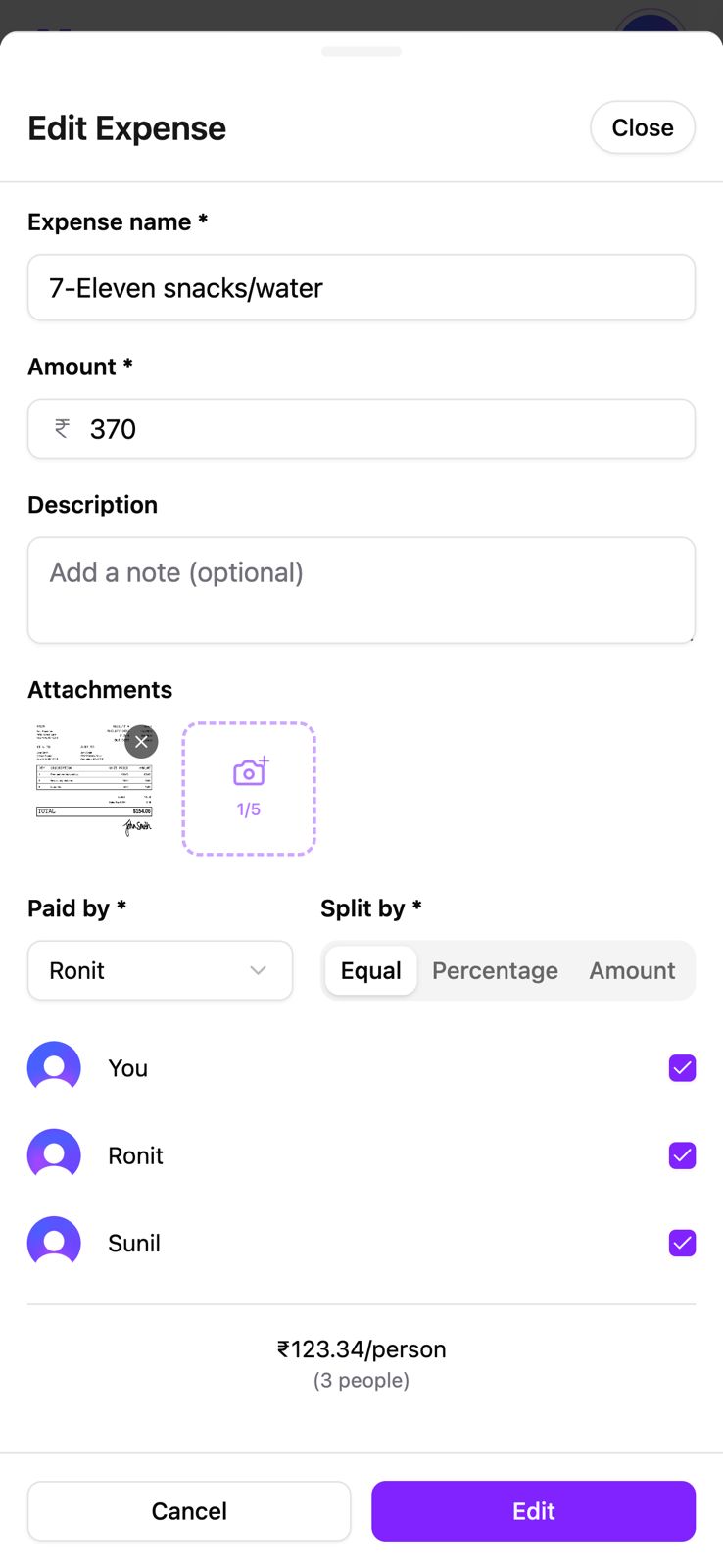
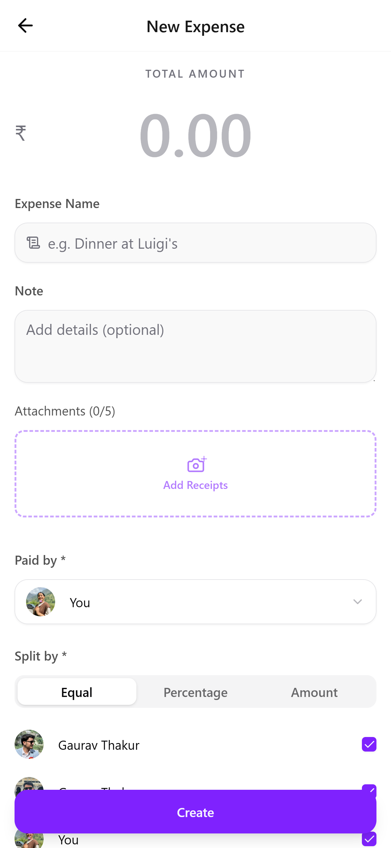
Create New Expense Page
PAIN POINT :” Screen feels dense and form-heavy”
PAIN POINT :” I wasn’t sure where to tap to upload the receipt”
PAIN POINT :” I had to squint to see the amount and primary button lacks importance.”
Before
After
1
By reducing visual clutter and improving hierarchy, the form feels lighter and easier to complete.
2
Attachments are now presented as a large drop-zone style area labeled Add Receipts.
3
The Create button is now visually dominant and placed where users naturally expect to complete the task.
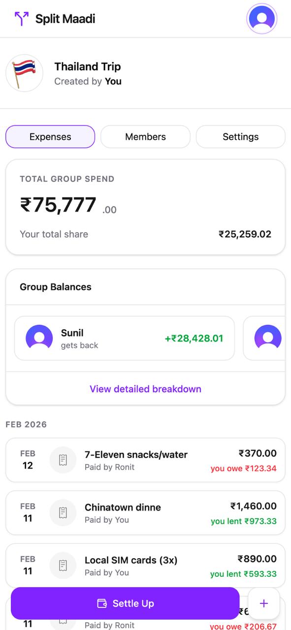
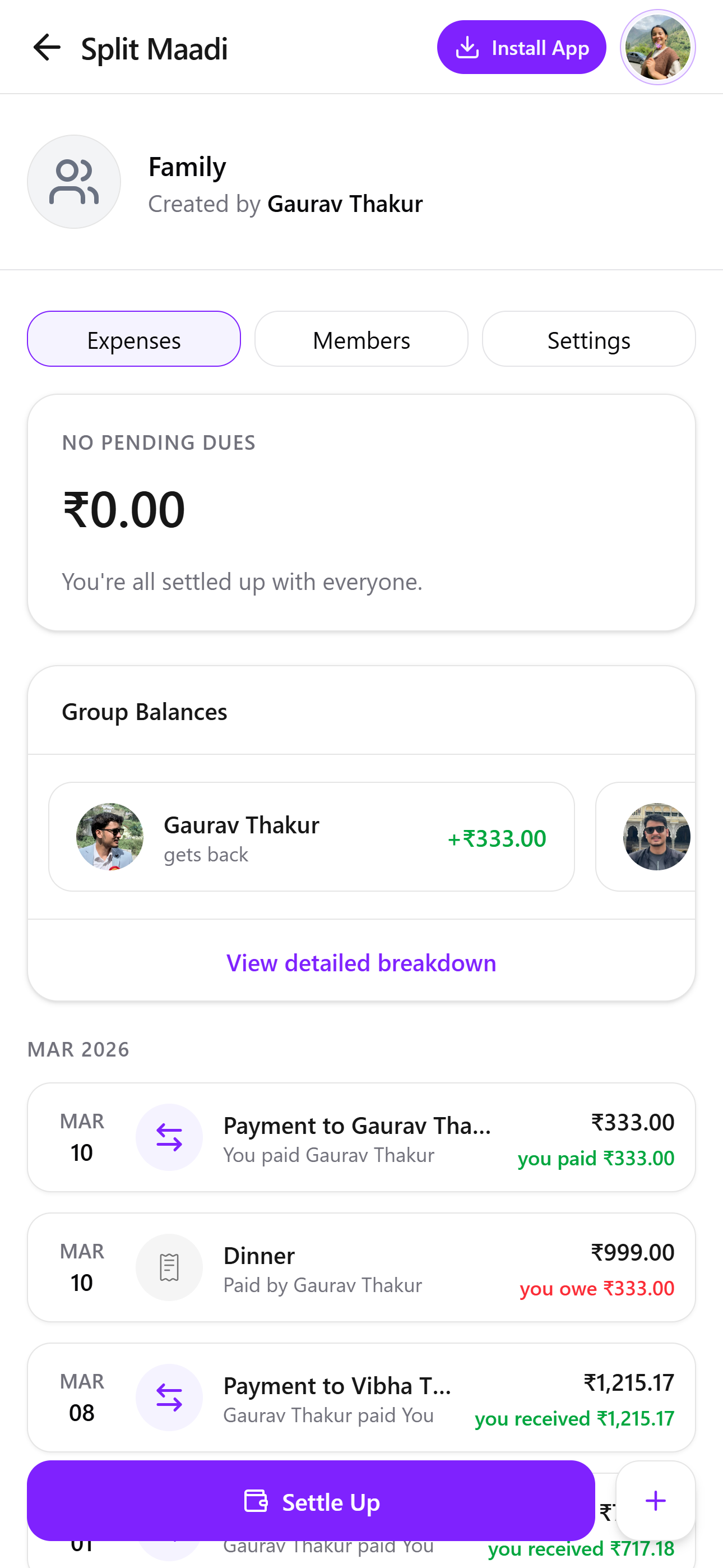
Settle Up Expense Page
PAIN POINT 1 :” I’m not sure why I need to see the total group spend.”
PAIN POINT 1 :”I’m mainly trying to figure out whether I need to pay someone or if I’ll get money back.”
Before
After
1
The Total Group Spend section was removed because it did not support the primary user goal.
2
The redesigned screen highlights whether users have pending dues or are settled up, making their financial status immediately clear.
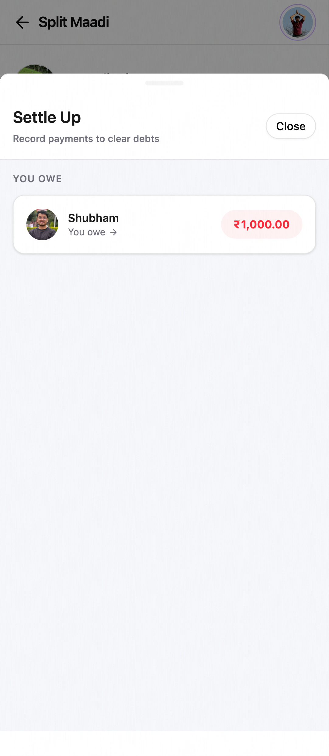
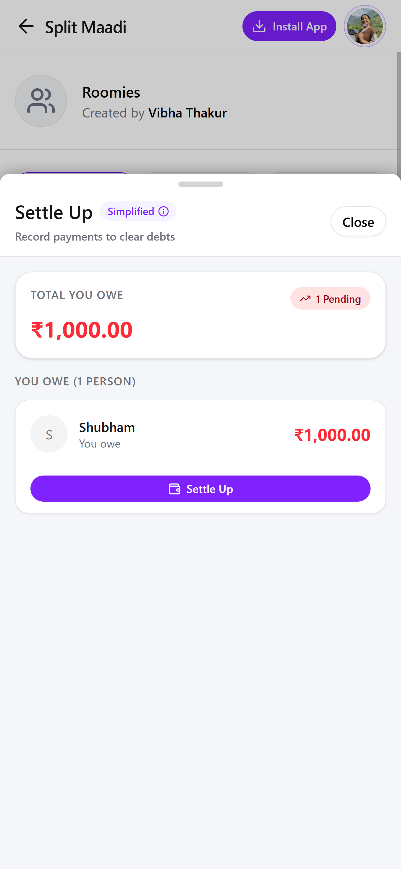
Settle Up Expense Page
PAIN POINT 1 :”I know I owe money, but there is no clear action button to settle the payment.”
PAIN POINT 1 :“This page feels almost empty.””
PAIN POINT 1 :“Who do I owe money to, and how do I settle it right now?”
Before
After
1
The new design introduces a Total You Owe section that clearly shows the user's pending balance.
2
The redesigned card includes a Settle Up button, making the next step obvious.
2
Users can scan the screen quickly and take action confidently and improved visual hierarchy.
Final Reflection:
Building SplitMaadi taught me that great design isn’t always about adding features - it’s about removing the ‘thorns’ that get in the way of human connectionBy prioritizing reliability, data integrity, and cross-platform flexibility, I created a tool that respects a user’s time and builds long-term trust. This project deepened my understanding of how even the most ‘functional’ tools can benefit from a human-centered approach, turning a daily chore inot frictionless, almost invisible experience.


